A critic's perspective on Near Mint/Mint

This was posted on the Facebook page "Utah's Art Critic: Ehren E. Clark,"  on January 25:

bbcards2sm.jpg

Justin Wheatley: Cards, Cards, Cards and Deconstruction

I have a very good friend whom those of you in the art community will need no introduction to, Mr Justin Wheatley, who is in a conundrum and I feel this is an ideal time for Utah’s Art Critic, AKA Ehren E. Clark, to lend his good buddy a hand, which is what good friends do, right?

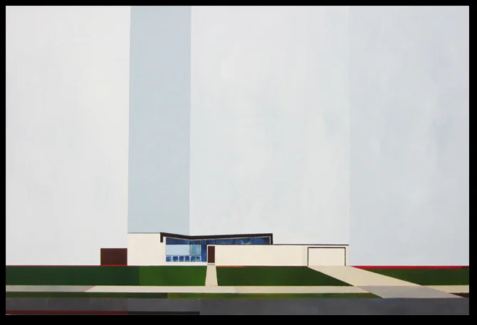
Firstly, what many of you who understand Wheatley’s art is, is that he is at root an existential artist, or at least, an artist who probes questions about the true nature of reality, especially as it applies beneath the surface. This is why so many of you know Wheatley’s homes that were an early development, then to larger structures, buildings in cities, bridges including the Manhattan. Most recently at a triumphant show of work at Finch Lane this spring, Wheatley chose to paint more nebulous buildings, structures, and the idea of ambiguity in a home was emphasized. Why, might one ask, is the reason for all of this attention on homes and building structures?

The truth of the matter is that when questioning human existential being, what more elemental in terms of form to provide a launching point in asking paradigmatic questions about human reality than the home, the city building, the bridge, and most certainly the nebulous structures that were featured recently?

It is the skin to the body. One looks externally to ask about the internal and quite often, elements that are less than physical or quantifiable can be considered when looking externally, more than often, in fact. What is the temperament of this person? Are they kind or not? Are they to be approached or should one stay away? Do they look generous enough to offer the time or give directions or are they the sort to rudely turn away? These qualities of character are just as easily perceived than the more physical such as is he attractive to you? What age is she? Is he physically fit? Is this person healthy or sickly? Is this person from appearances wealthy or poor or somewhere in the middle? Do they groom and take care of themselves?

Often, the positive attributes of the former will coincide with the positive attributes of the latter but of course this is never an absolute case and there are always unanswerable questions about an individual when just looking at them.

This is the same kind of philosophy of humanity Wheatley is presenting when focusing on an exterior of a home etc. A home or a building may have external attributes that cause one to assume characteristics about the goings on inside. A well kept garden on a neatly trimmed home indicates a well kept family or individual. The same for a building, that implies the office space or business ethics maintain discipline and those involved are the same. But is this always the case?

Of course not. Even the most charming or even grandest of homes might domesticate a living situation with someone who is entirely unfriendly, rude, anti-social, unwilling to contribute, to serve, to give of themselves, these homes can house the worst kinds of individuals just like the opposite, a meager and unkempt home may inhabit someone who is generous, kind, charitable and good, but may have an equally meager income due to elements entirely not of their own doing, a college student, or a hipster! They could be disabled, depressed for being alone, aged, sick, unloved. The building might be in a state of decay because the occupants are not able to pay bills for reasons entirely disparate from any association with their own character.
It seems that these anachronisms are the kind which Wheatley is most interested in and the questions of the non-absolute, unanswerable, that we simply can never know by exteriors but make this investigation so provocative when seen with Wheatley's eye for particulars of ambiguity, difference, irony, inconsistency, and a vagueness of “what is,” which apparently for Wheatley, “never IS.”

Bearing this essential philosophical paradigm in mind, it then becomes possible to enable the act of aid that led to this discourse. The situation is that Wheatley has many, many thousands of baseball cards and is interested, has already begun, using them in ways that can further his artistic milieu and function as an extension to his primary body of work. In the initial stages, Wheatley was at a loss as to how he might facilitate this and incorporate the project into his work and make something of it significant. After some difficulty, he has arrived at a point that finds these baseball cards and his treatment of them in line with his aesthetics in general, and I would like to take the opportunity to dictate to Wheatley here just why I see this latest jaunt as a successful one and one that is in tune with his philosophy, and how, and that this is a manner that would be wise to persist in.

I will discuss the four cards Wheatley posted on Facebook just days ago and why I feel they are a complete success and fall in line with his essential philosophies.

The first is a basketball card. Wheatley has cut some of the length off of each side of the inner photograph and then applied the two outer edges so it appears this is an elongated basketball card, but for the sake of art, we know very well it is not. In this play of the shape of the card, the elongation, Wheatley is deconstructing the absolute shape that is ubiquitous in sport and trading cards, and in this, with this athlete that is already so elongated himself, presents a synthesized version of the tradition card and shown an alternative, stylistically congruent, that presents a stopping short on the fundamental nature of the card and begs the question of just why does it have to be so and what is the reality of this century or so old tradition that has maintained the card be one shape? Is there anything to it at all besides tradition? Apparently there is as this card is so aesthetically pleasing.

The second card is another deconstruction. Wheatley presents a card that has been manipulated by placing one half of the card a male figure from the Star Trek Next Generation series and on the right a female. The card still functions and has even more appeal now with two popular figures instead of one, but on the card and even broader, in the media, how do we perceive certain characters and certain characteristics when identity is as real as the mutation of the two figures… not very.

The third card is as equally provocative and deconstructive. Here we have a popular baseball player, whose head has been cut off, and the top strip reattached to give it a semblance of something purposefully made. Here, Wheatley is presenting a major commentary that again, hinges on identity, and asks, is it the game we love or is it the sports hero, all of the hype… and there is so much hype?

If you were to say the fourth card is similar to the first you would be right only in that it portrays basketball. Everything else is different. Wheatley has not carefully cut the sides and reapplied the borders but cut right down the middle of the athlete, something imaginably blasphemous to any lover of basketball cards and especially a fan of this athlete. But it is a total defacement of the card that has been brutalized. Is this taboo? Are such cards a sacred part of our culture where such things just should not be done? We all might have our ideas on this but Wheatley has done it and unashamedly presents the case that invokes either a devil may care attitude or hot blood, never the less, it is the artist who takes the risks and risks come with their cautions.

In all four of these cards, the key element that is being officiated here is classic deconstruction. In the first, the very structure of the card is being deconstructed, the second, identity, in cards and in the media, the third, of sports and the idea of hero and celebrity or “just a game.” The fourth was a deconstruction on the sanctity of the card itself and the injury to the player who is being defaced, should this be taboo just as American as anti-flag burning or defacing the dollar bill.

This discussion has taught me more than I had already learned about Wheatley, as he is, from the many writings I have on him thus far as can be seen by the abundance on this page and many published, my favorite subject, as there really is no end to the investigation of his ever developing work. But the element of deconstruction in all of Wheatley’s work being paramount to the questioning addressed throughout this discussion, that we, as viewers, are presented with a duality and what the synthesis might be is the core of the work... this it so exciting!

With the cards, if Wheatley, “Hi Justin!” can maintain his “smarts” and his “invenzione” as they say in Italy, this construction, which is an actual means to a deconstruction, is something brilliant and provocative and completely attuned with the entire oeuvre and is less an appendage and is more an organic continuation of a body of work that is already airtight… and oh so fine. Can’t wait till Friday friend. EEC4

The Critique Cards

A few days ago I participated in a critique with ten other people. As part of the critique, I explained my Near Mint/Mint project and asked everyone in the room to participate. I handed everyone a baseball card and a sharpie. They were instructed to sign the card with there name, alter it in whatever way they wanted, and pass the card to the right. We did this until each card had passed through the hands of each person. The participants included Namon and Katie Bills, Steven and Sarah Stradley, Ehren Clark, Heather Teran, Liz Matthews, Shawn Stradley, a gentleman name Brian, and Justin and Camille Wheatley. These are the results, front and back:
 

bbcardscritiquesm.jpg

Splice

This series is influenced by artist and art educator Jorge Lucero. The images used in sports cards are carefully placed inside a small frame. I found it rewarding to remove and adjust parts of the frame and images to create new interest in photographs that are repetitive and lacking in creativity.  Below are four examples from this series of 100.

bbcards2sm.jpg

Near Mint/Mint: Collages

To address questions (11) "Can an object be changed by the collector in a way that makes it more valuable to the collector and less valuable to everyone else?" and (12) "Can I change the collected object in a way that it becomes more valuable to the collector and to everyone else?" I created a series of collages on baseball cards. As the collector, I am pleased with the collages, and without a doubt they have more value to me than before.

bbcardssm.jpg

A Side Project: Near Mint/Mint

Jose Canseco. 3.5" x 2.5" mixed media. This piece addresses the obsession with mint condition. By crumbling the card up I created something that I find more interesting than before. I then signed the card and am now calling it art. I destroyed any v…

Jose Canseco. 3.5" x 2.5" mixed media. This piece addresses the obsession with mint condition. By crumbling the card up I created something that I find more interesting than before. I then signed the card and am now calling it art. I destroyed any value the card had as a baseball card and am asking if it has value as a work of art.

Near Mint/Mint*

Baseball cards were an important part of my pre-adolescence. The memories that linger with the boxes and binders full of cards are good ones. At the time the cards weren’t necessarily about a love for the game or the players, but more about how much each one was “worth.” There was a monthly magazine that had lists of every card produced from every major brand since the beginning. It would tell the value of a card and if it had gone up or down.

I spent a huge portion of my paper route earnings on collecting thousands of baseball cards. I don’t regret it, but there is a bit of a shadow that hangs over my collection. None of the cards are valued anywhere near what they were nearly twenty-five years ago. What we were all told was a sound investment was a bust. But I didn’t stop collecting cards because they would end up being worth nothing. I stopped collecting cards because the companies began making special editions with high-gloss surfaces and gold leafed logos and the cost of a pack became too much. Even as a pre-teen I recognized something was wrong. It seemed like Topps, Score, Fleer and all the others were getting greedy and didn’t care the kid on the bike that couldn’t buy a pack any more. I still have those cards. The emotional and literal investment has kept me from getting rid of them. I have touched and looked at every single one of them hundreds of times.  Over the past three years I have thought about ways to address my childhood obsession through art. This will be my first attempt.


This project is an effort to explore the following thoughts. This list is completely tangible and will be added to and possibly subtracted from as the project progresses.
 

1.       What is the relationship that we have with objects we collect and can that relationship change over time?

2.       Why is it so important that objects be “mint” condition?

3.       If I love an object so much that it loses its “mint” status, is that object less valuable to me as the owner?

4.       Who controls the worth of an object and why should they be able to?

5.       Is collecting objects worthwhile?

6.       Are my art works just objects to be collected? Isn’t there a certain amount of irony in this?

7.       If no one knew about my collected objects other than myself, would I still collect them?

8.       How do I come to terms with all of the money I spent as a young kid collecting cards?

9.       Can I enjoy objects that other people have collected just as much as if I were the owner of the object I was trying to enjoy?

10.   Does an object that I have coveted for some time become less important or special once I have gained ownership of it?

11.   Can an object be changed by the collector in a way that makes it more valuable to the collector and less valuable to everyone else?

12. Can I change the collected object in a way that it becomes more valuable to myself and to everyone else?

This project will continue until I feel like it is done. I will add works of art as they are completed.


*Term used to describe the condition of a card or other collectable that is in perfect or near perfect condition


The Barn

White Barnsm.jpg

When I first posted an image of this painting on Instagram, I made the statement "Everyone needs to do a painting of a barn every three years or so." I wasn't kidding. Doing this painting was just what I needed. It was completely enjoyable. I am used to fighting with my work, but this was nothing of the sort. When talking about this to a friend, I told him that paintings, and any art work for that matter, are a battle. It is never an easy process. I go through so many ups and downs when I'm working on something that its a miracle anything ever gets declared finished. I don't mind the battle though. I enjoy it. If I have to fight to make a work of art successful, then I feel that accomplishment of knowing the battle was won.

As Long As We Know by Ehren Clark

This can be found at: https://www.facebook.com/utahartcritic

I am VERY excited to write this piece. It is called, “As Long as We Know,” because as long as we know that is the only thing that really matters as the art world is a level playing field and we must not disqualify ourselves before the games begin. As long as we know, we can be certain RANDALL LAKE is a world leader in expressive plein air impressionism which he handles with a palette rich and lush in hues that make his scenes full of vitality and essence of living. Lake has been around and paid his dues. Few can even touch him, here, there anywhere.

As long as we know, with credibility OONJU CHUN is an international leader in the very demanding art of total abstraction. She graces her canvases with a lighter side of the abstract that is airy and spontaneous and sophisticated in the art of Zen that strikes a balance in tonality with a joviality of intermediate hue that brings it to life.

As long as we know PAUL VINCENT BERNARD can be assured he is a world leader in abstract-semi representation. He is a master print maker and ostensibly there is no other printmaker alive who is better and has his methodology which is incredibly intensive, the line being so important to him, it coming to life as he digs it with his tuler in a density that recognizes open spaces and abstract shapes as canny subjects.

As long as we know JEFF PUGH IS a representational semi-abstractionist foremost on the international stage. Jeff plans his compositions to an incredible extent putting thought and effort into every compositional choice that he makes, which each read on many literal artistic levels, biographical, spiritual, formal, abstract, stylistically singular. It is truly a marvel how these components all come together with this amount of meaning and to put Pugh on a lesser plane of accomplishment simply because he lives in Salt Lake City is about as great an insult as there can be on who WE are.

As long as we know SUZANNE STORER from Ogden, who is showing now at The Gallery @ Library Square, is a sculptor but literally uncontested in her expressive abilities and formal extremes. Suzanne has broken major ground as she uses the nude and finds a distinctive angle and using first an exacting drawing of the subject using a rule of thirds, starts from this unique vantage point and utilizes all of her talents as a ceramist and builds that sculpture from something flat into three-dimentions and there is absolutely nothing like it and she is a world leader in sculptural avant-gardism. (Look for a feature I wrote on her in this weeks 15bytes Artists of Utah).

As long as we know another sculptor whose preeminence as a philosophical conceptual sculptor cannot be denied whose work is leading in the avant-garde, a full time professor at BYU is BRIAN CHRISTENSEN who is also a full time innovator, who ranks at the top of the field internationally.

As long as we know JUSTIN WHEATLEY may easily be one of the top 30 something painters alive. What he accomplishes in formal construction is always progressing and always extraordinarily focused in its articulation and manifestation being multi-media but very clean and linear using painting along with photography and paper to create two or three diminutional pieces that have a look that is nothing short of world class professionalism. But where world class professionalism ends Wheatley keeps going as the crust is the exterior of the core and these paintings and sculptures are in content existential in every aspect of their creation questioning the existentiality beyond walls, beyond the exterior, beyond today, beyond the facade, beyond what we understand and what we don’t. His work is philosophically huge and is a universal questioning of reality. I’d like to see any New Yorker or Californian try to compare themselves even if purely in form and only then in content and there are simply none out there who are up to the task, who will shy away with the amorphous, the arbitrary, the design, the street, the pretentiously jejune, the replicated, the politicized, the kitsch.

As long as we know, SLC, and there are more of you, many more, that is what really matters.

CODA Gallery, Park City

Dropping of new work at CODA Gallery in Park City 

Dropping of new work at CODA Gallery in Park City
 

IMG_7676.JPG

Stepping in to CODA gallery is a highlight of any trip to Park City. Owners Jen and Scott have put together an eclectic collection of art that is continuously changing and there is always something interesting to look at. On this trip I was dropping off work. It's always nice to talk to Jen and Scott and I appreciate how well they treat me as one of their represented artists.

Check out their site at: http://codaparkcity.com/

Jeff Pugh and Ehren Clark

I just read an article in 15Bytes by Ehren Clark about Jeff Pugh. I have a lot of respect for the work of both of these people. Even more, I have a lot of respect for them as individuals. They are both incredible people with a firm belief in what they do. Jeff creates beautiful work and is eager to help others do the same. Ehren's articles are the type that you want to read again and again, always finding something new in the intricate words. Take a look:

http://artistsofutah.org/15Bytes/index.php/jeff-pugh/

More Modern

This is the second painting in a series of mid-century modern homes.  

White House Brown Door 24" x 36" Acrylic

White House Brown Door
24" x 36"
Acrylic

A couple of drawings

Sometimes it's nice to just sit back and sketch. A couple of weeks ago I made about ten collages with the intent of drawing on them. These are the first two.

Avenues House #1
8" x 8"
Graphite on paper collage

Avenues House #2 6" x 6" Graphite on paper collage

Avenues House #2
6" x 6"
Graphite on paper collage

Mixed Media and Works On Paper

Last night we went to one of the best shows we've seen in Salt Lake City all year. Laura Durham, Visual Arts Manager for Utah Arts and Museums, says "I believe this is one of the best Statewide Annual Exhibitions we've had to date." The Mixed Media and Works On Paper show is juried and takes place every three years.  I'm happy to be a part of it, and even more thrilled to see work by friends and colleagues Steven Stradley, Namon Bills, Caitlin Connolly, Paul Vincent Bernard, Linnie Brown, Al Denyer, Michelle Montrose, Dan Barney, and Roland Thompson. My piece, The Grass Is Greener , and Dan Barney's E Pluribus Unum: Bipartisan Structure

In the gallery. 

In the gallery. 

 My piece, The Grass Is Greener , and Dan Barney's E Pluribus Unum: Bipartisan Structure

 My piece, The Grass Is Greener , and Dan Barney's E Pluribus Unum: Bipartisan Structure

Opening night. 

Opening night. 

IMG_5247.JPG

Salt Lake City Gallery Stroll October 18th

I'm excited for this months gallery stroll. I have work in three places - Evergreen Art Gallery (3295 S 2000 E), Alpine Art (430 E South Temple), and the Rio (300 S 455 W). The Rio is hosting a juried show with mixed media works and works on paper.  

Here's a list of all the participating galleries

rio.jpg

A little bit of LA architecture

On our quick trip to LA last weekend, we were able to see a good amount of art and architecture. In the outskirts of Culver City, in an area called the Hayden Tract, is an industrial complex that has been revitalized by architect Eric Owen Moss.
The place is amazing. We walked a few blocks that were lined with building after building of monuments to contemporary architecture.

Here's a couple of articles about the architect and the place:  New Yorker, Patch

Artworks for the Cure: Part II

We had an incredible experience being involved with Artworks for the Cure. Here are a few shots from the events on Friday and Saturday nights. Most of it is artwork, including my two pieces. Colbie Caillat entertained us on Saturday night. The event reached its goal of raising over 1 million dollars for the TJ Martell foundation.